Recommended Products
- No recommended searches
Suggestions
- No Suggestions
Site Pages
- No Related Site Pages
Use Promo code SUMMER15 to receive 15% Off Sitewide! View details.
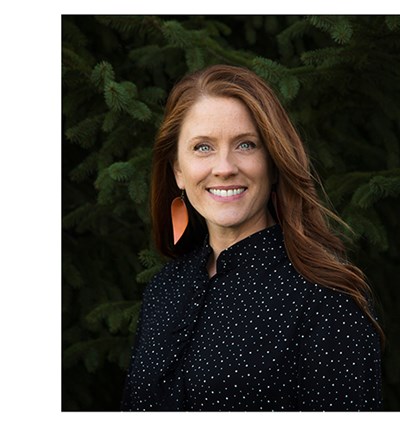
So… I have the BEST job. Growing up, I always loved art, but didn’t know I would find a career in it. I actually thought I might become an interior designer.
But I’m so glad I came to Cambridge. One of the things I have to do is to seek out trends, and then do something creative with them. Our team travels all over the world to be sure we are always trend-forward.
Our Creative Director believes in pushing us creatively and allows time for that. At Cambridge, we have fun art days a few times a year. Everyone participates: designers, the production team, the writing staff, color specialists, and photographers.
It almost feels like we’re a bunch of middle-schoolers trying out different mediums. There’s a lot of laughter! We do watercolors, hand-lettering, and all types of techniques that might be trending like paper cutting, alcohol ink, stamping, whatever.
After a recent art day, we were talking about the new collections, and how we wanted to handle the botanical/palm trend that was still very active. We had done some gorgeous planners in this tropical vibe, and we wanted to approach it from a fresh perspective.
I pulled out some of the things that had been created on our Cambridge art day, and when I saw the cut paper designs, voila! There it was: Paper Palms. I love that it is on trend, but it’s a little more abstract. The pale pinks and corals really pop off of the rich navy background. It’s feminine, but a little funky.
I love seeing it on the shelf, and can’t wait for our next art day!